US Sector Rotation Backtest: 28-Year Performance ReportEntries only — by design
QuantOrb (www.quantorb.pro) — report published 26 August 2026 · data window Dec 1998 → Aug 2026 · every figure carries its sample size (n) and standard error (±SE)
The short answer: QuantOrb times entries — when to step into a sector — with exits deliberately left to the trader. Across 28 years of data, the two entry rules are what cleared our statistical bar — every published signal carries its own evidence.
This page summarizes the journey. The evidence lives in three sub-pages: the full test tables, how the statistical bar works, and exits and practical use.
The results at a glance
| Signal type | Best win rate @20d | n | ± SE | Status |
|---|---|---|---|---|
| BUY (published) | 62.7% | 2,403 | ±1.0pp | LIVE on site |
| CONTINUATION (published) | 60.1% | 3,501 | ±0.8pp | LIVE on site |
| D1 — early-distribution probe | 61.4% | 758 | ±1.8pp | turned out to be an early-BUY |
| All 30+ exit candidates evaluated | 43.2% (drop) | 526 | ±2.2pp | evaluated · archived |
How the research unfolded
| Phase | What we asked | Result | Where |
|---|---|---|---|
| 1 · Baseline 28y daily, 1998–2026 | Do the two entry rules hold up over nearly three decades of daily data? Pre-defined gates: n>500, margin of error clear of a coin flip. | BUY 62.7% ±1.0pp (n=2,403) and CONTINUATION 60.1% ±0.8pp (n=3,501). Both clear the bar → published on the live tool. | tables ↗ |
| 2 · Pattern-based SELLs 28y daily | Momentum-exhaustion chart patterns observed in live markets: greyed-out momentum days, isolated streaks, divergence candles, short-window fades. | All six rise ≈60–66% — right where the zone's strength base rate predicts (~40% drop ceiling). Momentum confirmed on its own terms. | tables ↗ |
| 3 · Systematic candidate families 28y daily | A–D rule families built by an external model, scored blind with thresholds fixed before evaluation (velocity decay, two-stage confirmations, regime weighting). | Drop rates 37.9–41.8%; two-stage variants cast a wide net (n≈5,600+) without adding to the base rate; combos n≈310. A systematic map of the full territory. | tables ↗ |
| 4 · Intraday confirmation ~2.9y hourly tape | Can finer-grained volume/flow data find exits the daily tape hides? Nine intraday designs incl. AVWAP breaks and session-flow ratios. | Drop 30.8–43.2%, with the closest (I-CLV5, n=526) rising 56.8% of the time — the hourly tape echoes the daily findings. | tables ↗ |
| 5 · The other side of the fence 28y daily | Final candidate in a different zone entirely: first day a sector flips into distribution, before the BUY zone is reached ("D1"). | Rose 61.4% ±1.8pp; 57.5% of those days printed a later BUY — an early-BUY that testing has added to the research archive. 🔎✓ | analysis ↗ |
| 6 · Conclusion | Each battery was scored against the pre-defined bar on its own side of the market — a clean decision with every number on record. | A focused product. Entry labels only, each carrying published evidence — plus standard exit guidance for users. | guide ↗ |
CONTINUATION as an early attention flag
An extra way traders read the dashboard: fresh C days mark ground that is stretched, above its band, and drawing volume — and the market's first week there is its most two-sided stretch. The figures below come from the site's own data file (updated after every US close).
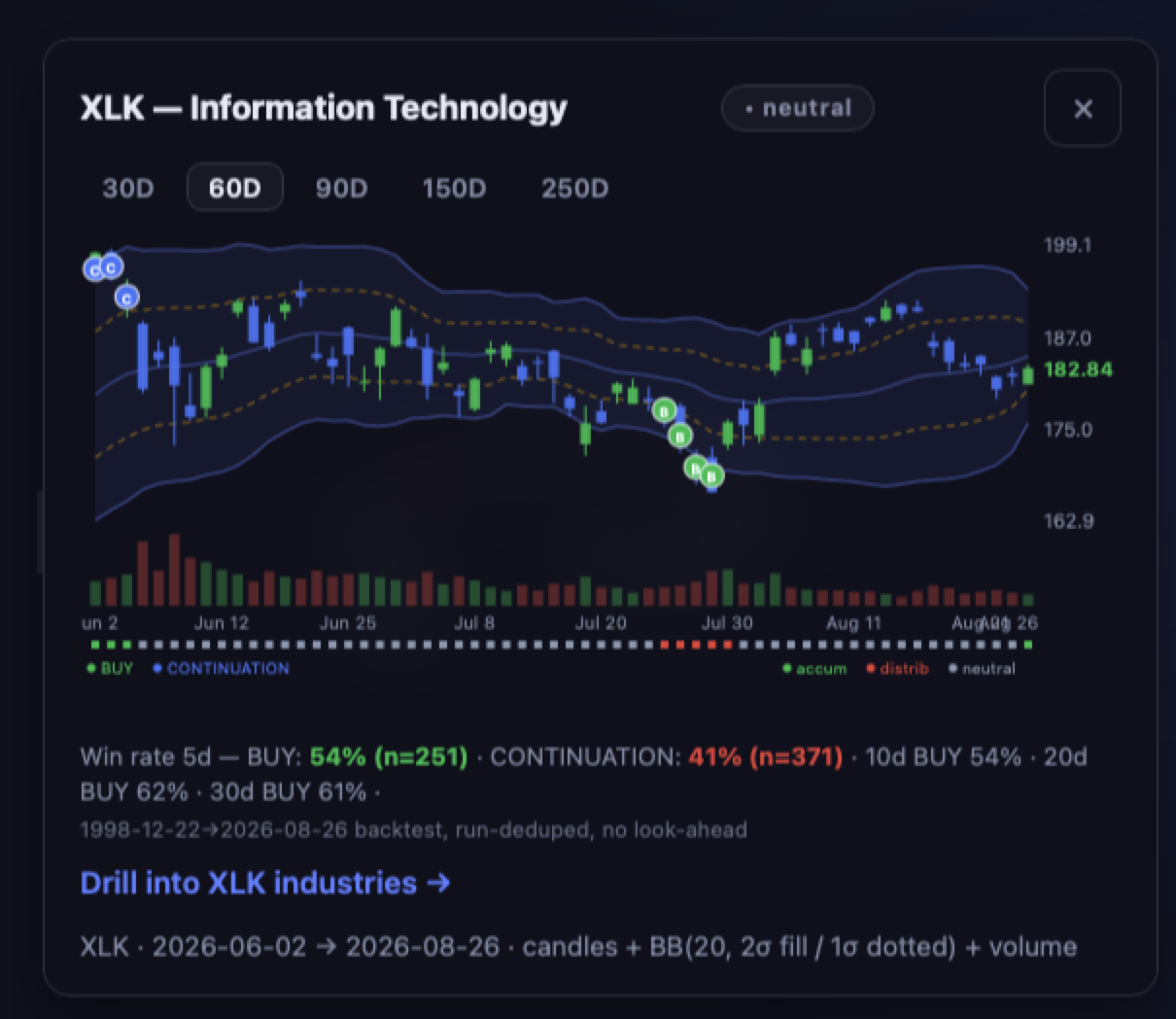
Across the full record, the ride after a fresh C is positive more often than not — yet the first five sessions carry the widest error band of the whole trade, and that is exactly when extended charts are most likely to pause:
| Sessions after a fresh C | Price higher | n | ± SE |
|---|---|---|---|
| Day 5 | 54.6% | 3,499 | ±0.8pp |
| Day 10 | 58.0% | 3,495 | ±0.8pp |
| Day 20 | 60.2% | 3,489 | ±0.8pp |
| Day 30 | 61.0% | 3,484 | ±0.8pp |
The pullback side peaks in that same opening week (decline rate 45.4% at day 5, fading as the move matures) — a mirror image of the taper above. When several sectors stack fresh Cs together, conditions are crowded enough that some give-back is statistically routine; treat such clusters as an attention flag and manage risk per the exit rules. These figures come from the live data file and drift a hair with each session relative to the frozen research snapshot quoted elsewhere on this page.
… sectors sit in accumulation now (data ) — those are your candidates to watch.
Follow the next round of testing — join the Beta Test News list
We keep researching: industry-level baskets, multi-timeframe confirmations, and new entry refinements. Beta subscribers get an email when a new back-test goes live or when we need testers before features ship. No noise, no marketing — test results and build previews only.
One field, one click, unsubscribing is a single reply. We store your address and which page you joined from — nothing else. No third-party trackers.
Reading order
- Inside the statistical bar — the three structural findings, plus the asymmetry between buying dips and selling tops.
- Full test tables — every candidate with n, rate and ±SE; baselines, protocol, and per-family results.
- Exits & practical use — the two standard exit rules, indicator-by-indicator breakdown, what the tool leaves to the trader.
This report is for informational purposes only and is not investment advice. Past performance does not guarantee future results. See our disclaimer.